How to hang posters stylishly? 7 clever ideas
A poster can take a bare wall from ‘meh’ to wow till you drop in five minutes. But how do you hang posters stylishly without it looking like your favourite prints just randomly ended up together? The difference isn't in a perfect designer interior, but in a plan: choose a composition, consciously repeat something, and give your wall enough breathing space.
Posters are fun precisely because you can move them around, combine them, and give your home a different vibe without redecorating an entire room. A cheeky quote above your desk, a colourful graphic in the hallway, or a serene art print next to a striking vase: anything goes, as long as it looks intentional.
How to hang posters stylishly on the wall?
Don't start with the nail, but with the spot. First, observe what's already happening in the space. Does your living room have a large sofa, a low cabinet, or a striking mirror? Then your poster wall should respond to that. Don't hang art high up on the wall just because there's space there. Hang it at eye level and in proportion to the furniture below it.
As a rule of thumb, it works well when the center of a single poster hangs approximately 57 to 60 inches from the floor. Above a sofa, bed, or sideboard, the bottom edge should remain about 6 to 10 inches above the furniture. This way, the wall decor feels connected to the space, instead of loosely floating above it.
When it comes to a seating area, scale is extra important. A small A4 poster above a wide sofa immediately disappears. It's better to choose one large poster, two generous prints side-by-side, or a group that collectively takes up about two-thirds of the width of your sofa. Do you have a compact corner? Then a single small poster can be very chic, especially if you combine it with a lamp, plant, or wall shelf.
Slide first, then hang
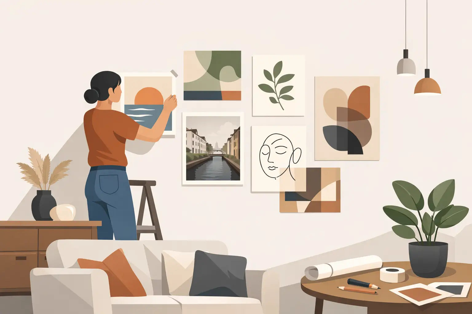
Lay your posters on the floor and create your composition there first. Even better: cut kraft paper sheets to poster size and tape them to the wall with painter's tape. This way, you'll immediately see if a print is hanging too high, if the spacing is correct, and if that one extra poster improves things or makes it too busy.
Also measure the space between the frames. For a clean gallery wall, 2 to 3 inches between each frame usually works beautifully. Do you want a lighter, more playful effect? Vary it a bit more, but keep the difference intentional. Random distances quickly look messy. Playful is not the same as chaotic.
Choose one style rule that holds everything together
A poster wall absolutely does not have to consist of identical prints. In fact, a mix of art, photos, typography, and colourful illustrations offers much more personality. You just need one connecting element. This could be the colour of the frames, a recurring hue in the prints, the same theme, or a similar mood.
Black frames immediately make a colourful collection more graphic and serene. Wooden frames add warmth to soft colours, botanical prints, and a retro interior. Want to be bolder? Mix a bright coloured frame with calm prints, or choose one glossy metallic detail among matte frames. Then keep the rest subdued, because one showstopper works better than five that all demand attention simultaneously.
Even without a frame, you can hang posters stylishly. Use wooden poster hangers for an airy, creative look or attach a print with beautiful clips to a narrow rail. This is ideal if you often change your mood. Tape can also work, but choose tape that genuinely adds something, such as colourful washi tape in a child's room, home office, or playful gallery wall. In a mature, calm living room, a frame usually looks stronger and more polished.
Go for a composition that suits your wall
There's no single perfect poster wall. The best arrangement depends on the shape of your wall, how many prints you have, and how much drama you want. These four compositions almost always work:
- The serene duo arrangement: two posters of the same size side-by-side. Perfect above a sideboard, dining table, or bed and instantly chic without much fuss.
- The clean grid: four, six, or nine frames in equal sizes. This brings calm to colourful art and suits a modern space well.
- The playful gallery wall: different sizes, with one larger print as an anchor point. Ideal for a staircase, hallway, or a wall that could use some personality.
- The leaning look: place a framed poster on a cabinet, shelf, or floor against the wall. Relaxed, easy to change, and extra beautiful with a vase, candle holder, or small ornament in front of it.
Work with a visual anchor
In a playful composition, your eye needs something to hold onto. That's your anchor: often the largest poster, an extra striking colour, or a print with high contrast. Hang that first and build around it. Place smaller posters around it, not all on one side. This maintains balance, even if the frames aren't identical.
Also pay attention to colour distribution. Do you have one bright red print? Then subtly repeat that colour in a second poster, a candle, or an object on your cabinet. It doesn't have to be the exact same shade of red. The point is that the room feels like everything is communicating with each other.
Let your posters work with your interior
A poster isn't just a loose picture on the wall. It becomes stronger when you pair it with what's underneath. A light print pops beautifully above a dark sideboard. Above a light sofa, a black frame or a poster with deep colours can add vibrancy. Do you have a colourful interior? Then don't automatically opt for even more vibrant prints. A calm black and white image can be exactly the pause your space needs.
Also consider repetition in form. Do you have many round mirrors, organic vases, and soft furniture? Choose posters with round lines, abstract shapes, or wavy typography. In a more minimalist interior with straight furniture, graphic prints, architectural photos, and clear lettering often work fantastically.
Lighting makes a surprisingly big difference. A poster in a dark corner can get lost, no matter how beautiful the print is. A table lamp on the cabinet below, a wall lamp next to it, or directed light creates atmosphere and makes colours pop better. Avoid bright light directly on a glossy frame if you get a lot of reflection. Then you'll mainly see yourself instead of your art.
Protect your wall and your posters
For rental homes, temporary inspiration, or light prints, self-adhesive poster strips are a smart choice. However, always check the weight of the frame and the surface of your wall. Strips may not adhere as well to textured paint, crumbling stucco, or a damp wall. A small nail or screw is often the safer option then.
For larger frames, use two hanging points. This makes the poster hang straighter and less likely to tilt when someone walks past the wall or closes a door. For a gallery wall, a spirit level is your best friend. A slightly crooked frame always stands out, even if no one can quite explain why.
Also, don't hang posters directly in bright sunlight if you want the colours to stay vibrant. Especially inexpensive prints and paper without UV protection can fade over time. A frame with glass or plexiglass helps against dust and damage, but for a sunny spot, it's better to choose indirect light.
Give yourself permission to change
The best thing about posters? They don't have to stay up forever. Swap a print with the seasons, move your favourite quote from the hallway to your home office, or combine a new find with what you already have. This way, your interior always feels fresh, without you having to buy big furniture every time.
If you want an easy start, choose one poster that spontaneously makes you happy and quietly build around it. A quirky graphic, a warm colour, or a sentence with a bit of attitude is sometimes all a wall needs. Hang it where you see it every day – because a home with character often starts with just one good print.