Trendy vase colors that spice up your interior
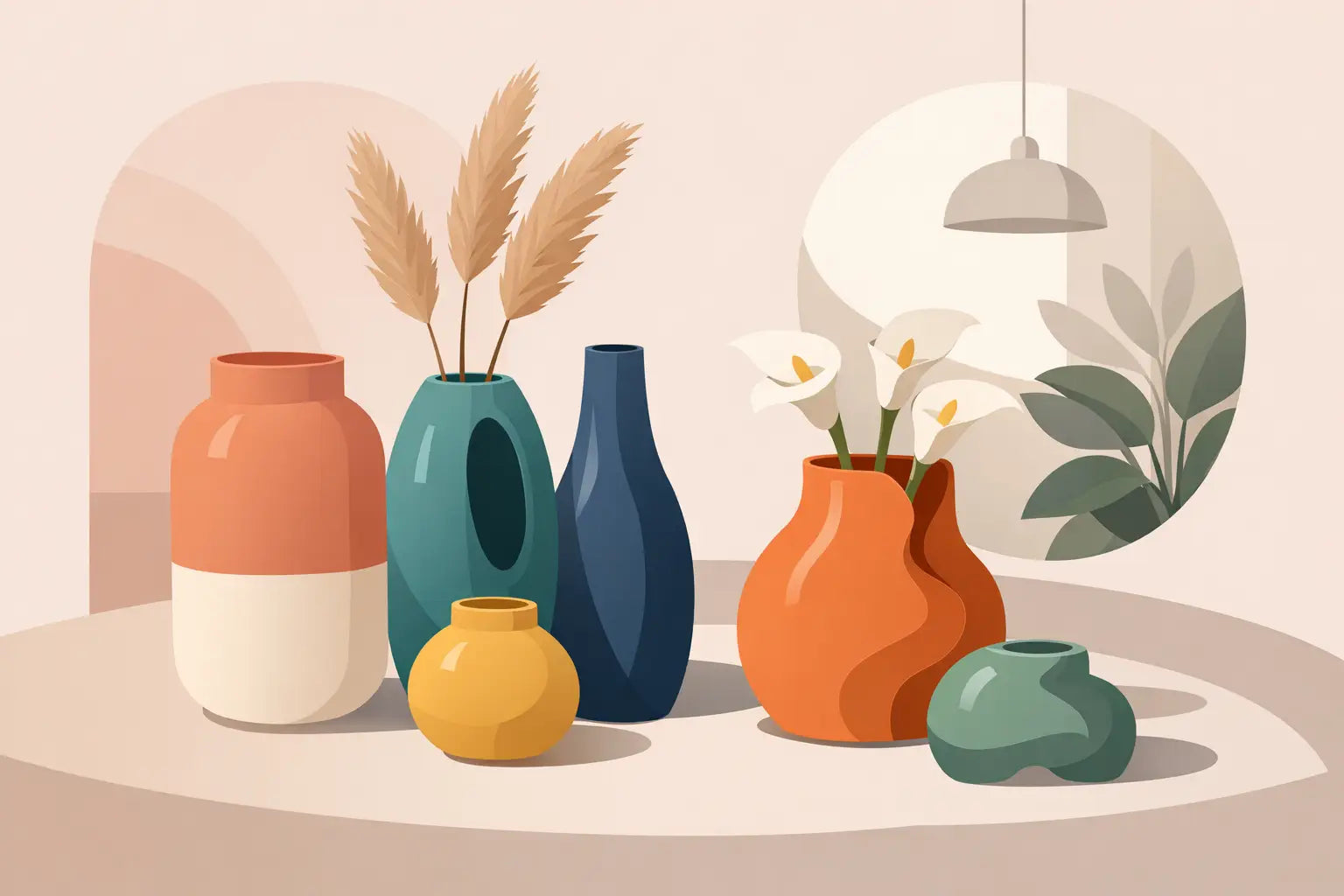
A vase is no longer just a parking spot for a bunch of flowers. With the right trendy vase colors, you can instantly add personality to a windowsill, dining table, or empty shelf. The best part: you don't need to plan a complete makeover. A single vibrant pink vase, a soft butter-yellow buddy, or a sculptural cobalt blue piece can be enough to liven up your interior.
The color you choose doesn't just determine how your vase looks, but also how the entire space feels. Calm, cheerful, chic, a little rebellious, or strikingly bold? These are the colors and combinations that will make your home anything but standard.
Trendy colors for vases with character
Butter yellow for instant sunshine
Butter yellow is soft, warm, and a little nostalgic, without being dowdy. It's the perfect color for those who want cheerfulness but don't need a complete color show in the living room. A yellow vase looks beautiful on a wooden table, next to linen cushions, or against a white wall that could use some life.
Opt for a matte ceramic vase if you want to keep it subtle. Feeling a bit bolder? Go for glossy yellow glass or an organic shape with bumps, stripes, or an unexpected handle. Combine butter yellow with lilac, light blue, or tomato red for a playful look. With natural-toned dried flowers, it remains soft; with brightly colored tulips, it immediately becomes festive.
Cobalt blue as a cool eye-catcher
Blue is familiar, but cobalt blue has a bit more volume. This deep, bright color instantly adds a graphic edge to a calm interior. Think of a blue glass vase on a coffee table with books, a vase on a white cabinet, or a striking duo on an open kitchen shelf.
Cobalt blue works surprisingly well with warm materials. Wood, rattan, brass, and terracotta take the coolness out of the color and make the whole look cozy. In a minimalist interior, blue can take center stage: choose one large model, place it freely, and let its form speak. A vase doesn't need to be filled to attract attention.
Tomato red and cherry red for boldness
Red is back, and not to quietly fade into the background. Tomato red and cherry red energize an interior. These are colors for a vase that you don't tuck away among ten other accessories, but prominently display where everyone can see it.
A red vase works fantastically as a contrast in a neutral space with beige, cream, gray, or black. Red also looks surprisingly strong next to pink. The result feels less classic than red with green, and very modern. Do you find a big red statement daunting? Start with a small vase on a stack of coffee table books, or place two together in different heights. Small gesture, big effect.
Lilac and plum for a soft twist
Lilac is playful, fresh, and slightly different from pink. The color brings a light retro vibe, especially in transparent glass. Plum and aubergine are its deeper relatives: richer, more atmospheric, and beautiful in autumn and winter, without making your home feel dark.
A light lilac vase easily combines with silver, chrome, clear glass, and soft pastels. A plum-colored vase, however, stands out beautifully next to warm brown tones, a dark red candle, or a copper detail. It's a good choice if you want to add color but find bright primary colors too intense.
Green, but olive, moss, or pistachio
Green remains an interior favorite because it suits almost everything. However, the fresh standard green has been replaced by shades with more personality. Olive green and moss green are earthy and calm. Pistachio is lighter, more playful, and perfect for a corner that could use some fresh energy.
Dark green ceramics feel luxurious on a dining table with wood and a linen tablecloth. Pistachio glass looks great in sunlight, for example, in front of a window with a loose branch, a few anemones, or a wild bouquet. Green on green can work well: place a vase next to plants, but vary the material and shade. This way, your vase won't disappear into the jungle.
How to choose a color that truly works in your home
Don't just look at the color of your walls. The small details reveal which vase color feels logical: a piece of art, the print in your rug, a striking cookbook, or the color of your dining chairs. Echo one accent from these in a vase, and your interior will immediately look more thoughtful, even if you only thought about it for five minutes.
Do you primarily have a calm interior with sand, white, beige, and wood? Then you can confidently go for red, blue, or lilac. The vase will be the cheerful exclamation mark. Is your home already full of patterns, color, and unique furniture? Then choose a vase in a shade that is already present, but play with form. A bright yellow vase with a twisted neck or a moss-green model with a quirky texture still adds zest without visual chaos.
Material greatly changes the color perception. Glossy glass makes shades brighter and lighter. Matte ceramics give the same color more calm and depth. A transparent vase allows stems, water, and light to be part of the visual, while an opaque vase stands more strongly as an object in itself. So don't just think: what color do I want? Also ask: do I want this vase to sparkle, soften, or stand out?
Combining trendy vase colors without creating boring sets
You don't need to buy three identical vases to create a beautiful ensemble. In fact, a grouping becomes much more interesting when color, height, and material challenge each other a little. For example, place a low red ceramic vase next to a tall transparent-lilac vase and a small cobalt blue object. The colors differ, but by placing them as a group, they feel deliberately chosen.
For a successful vase combination, it helps to keep one element calm. Either choose different colors with similar shapes, or different shapes within one color family. If you mix everything at once, it can become messy. Unless you live maximalistically, of course. Then messy is sometimes just a style choice with great flair.
The contents can also play a role. Ton-sur-ton flowers give a calm, luxurious look: red flowers in a red vase, lilac flowers in lilac glass. If you want more contrast, choose complementary colors. Orange flowers pop beautifully in a blue vase, and pink flowers get extra energy in a green vase. For a modern, calm look, branches, grasses, or a single sculptural flower are often enough.
Where to place a colorful vase?
A striking vase deserves a spot where it can be seen. On the dining table, a low, wide model works well, as you can still converse with each other. On a sideboard or cabinet, you can think taller: combine a large vase with a lamp, mirror, or art print for a strong corner.
The windowsill is ideal for transparent glass and cheerful colors, as daylight makes the vase look different every time. In the bathroom, a small vase in pistachio, lilac, or cherry red can surprisingly do a lot among all the neutral tiles and towels. And don't forget your hallway. A special vase at the entrance immediately says: someone who doesn't settle for boring lives here.
If you choose a large floor vase, pay attention to the proportion. In a small space, a very wide or dark model can look heavy. A slender, tall vase in clear glass or a light color keeps it airier. In a spacious living room, you can think big with a deep blue, dark green, or plum-colored eye-catcher.
Give your vase a starring role
Ultimately, the best trendy color isn't the one everyone chooses, but the color that makes you happy every time you walk by. Whether that's butter yellow, bold red, or a whole collection of colored glass: let your vase say something. A home with personality often starts with just one object that makes you spontaneously smile.