Making a gallery wall in the living room? Here's how
An empty wall can make a living room feel surprisingly bare, even if your sofa, rug, and lighting are all perfectly in place. That's why creating a poster wall in the living room is such a smart move. Not only do you fill space, but you immediately give the room more character, rhythm, and fun – without needing a complete makeover.
Why a poster wall works so well in the living room
A poster wall is one of the fastest ways to add atmosphere. Where a large cabinet or new sofa requires a significant investment, a well-composed wall delivers immediate results with relatively small interventions. You can play with color, size, humor, photography, typography, or abstract prints. As a result, your living room feels less standard and much more like your own space.
Even better: a poster wall easily grows with you. Today you might go for soft natural tones and organic shapes, next month you can add a bold quote or a striking graphic print. This makes the idea perfect for anyone who loves variety and doesn't want to be stuck with one conservative style.
Before you start: first choose the vibe
The biggest mistake? Buying individual posters that you like separately, but which together don't tell a story. A good poster wall doesn't start with the frame, but with the atmosphere you want to create.
If you want peace and calm in the living room, opt for ton-sur-ton colors, soft lines, and calm compositions. If you want it to be more exciting, contrasting colors, a mix of illustration and photography, and striking texts work very well. If you like a playful interior, it can certainly be a bit quirky. Think of a combination of artistic prints, graphic shapes, and a print with a wink.
Also consider what is already in your living room. If you have a soft boucle sofa, light walls, and wood tones, a poster wall with sand, black, and warm terracotta often works well. If you have a more colorful interior, you can match the wall or deliberately choose a contrasting direction. Both are possible - as long as it's a conscious choice.
Creating a poster wall in the living room above the sofa
The space above the sofa is by far the most popular, and for good reason. A poster wall there immediately makes an impact. But the proportions must be right, otherwise it will look cluttered or lost.
As a rule of thumb, it works well when your composition occupies about two-thirds of the width of your sofa. For a small two-seater, you don't need to hang mini-posters that disappear against the wall. And above a generous corner sofa, you can certainly think bigger. That looks calmer than many too-small frames floating somewhere in the middle.
Don't hang the wall too high either. Art should visually belong to your seating area, not glued to the ceiling. Usually, a mid-height at eye level works best, but above a sofa, you can go slightly higher as long as the distance between the sofa and the bottom frame remains comfortable.
Which layout suits your living room?
Here lies the difference between neat and exciting. There are roughly three approaches that almost always work.
Sleek and symmetrical
If you like calm, a straight grid arrangement is a safe winner. Think of two or three rows with identical frames and equal spacing. This feels clean, modern, and organized. Ideal in a living room that already has enough striking furniture or accessories.
Loose but balanced
If you want more personality, opt for a playful gallery wall. Here you mix sizes, heights, and images, but within a clear color palette. It may seem casual, but there's actually quite a bit of logic behind it. It's precisely that mix that gives a living room energy.
One big eye-catcher with support
Also strong: start with one large poster or art print and add smaller works around it. This gives the wall an anchor point. This works well in larger living rooms or when you like to make a statement but don't want it to be too busy.
Sizes and frames: where you win on appearance
It's not just the print that matters. The frame largely determines how luxurious, airy, or outspoken your poster wall looks.
Black frames provide contrast and a modern edge. Wooden frames feel warmer and softer. Colored frames can turn out great but require a bit more daring and a good eye for balance. If in doubt, choose one frame color for a calm look. If you want an eclectic look, you can combine different frames - but then keep the prints themselves a bit more in line.
In terms of size, variation is often more beautiful than everything being the same. A mix of small, medium, and large adds depth. But in a small living room, too much difference can actually create unrest. In that case, a set with two or three sizes often works better than a very diverse collection.
Passe-partouts, by the way, are a clever trick. They make posters look more luxurious and give the composition more breathing room. Especially if your prints are already colorful or busy, such a white border immediately brings calm.
Choosing color without it becoming a circus
A poster wall can stand out, but your living room should still feel pleasant. The easiest way to achieve this is to work with a limited palette.
For example, choose two main colors and one accent color. Black and beige with a touch of olive green. Or pink and red with a little lilac for extra zest. This creates coherence, even if the images are very different.
If you already have a lot of color in your furniture and accessories, a calmer poster wall is often smarter. If your living room is quite neutral, the wall can certainly steal the show. That's the beauty of it: it all depends on what the space is already doing.
Lay it on the floor first, then drill
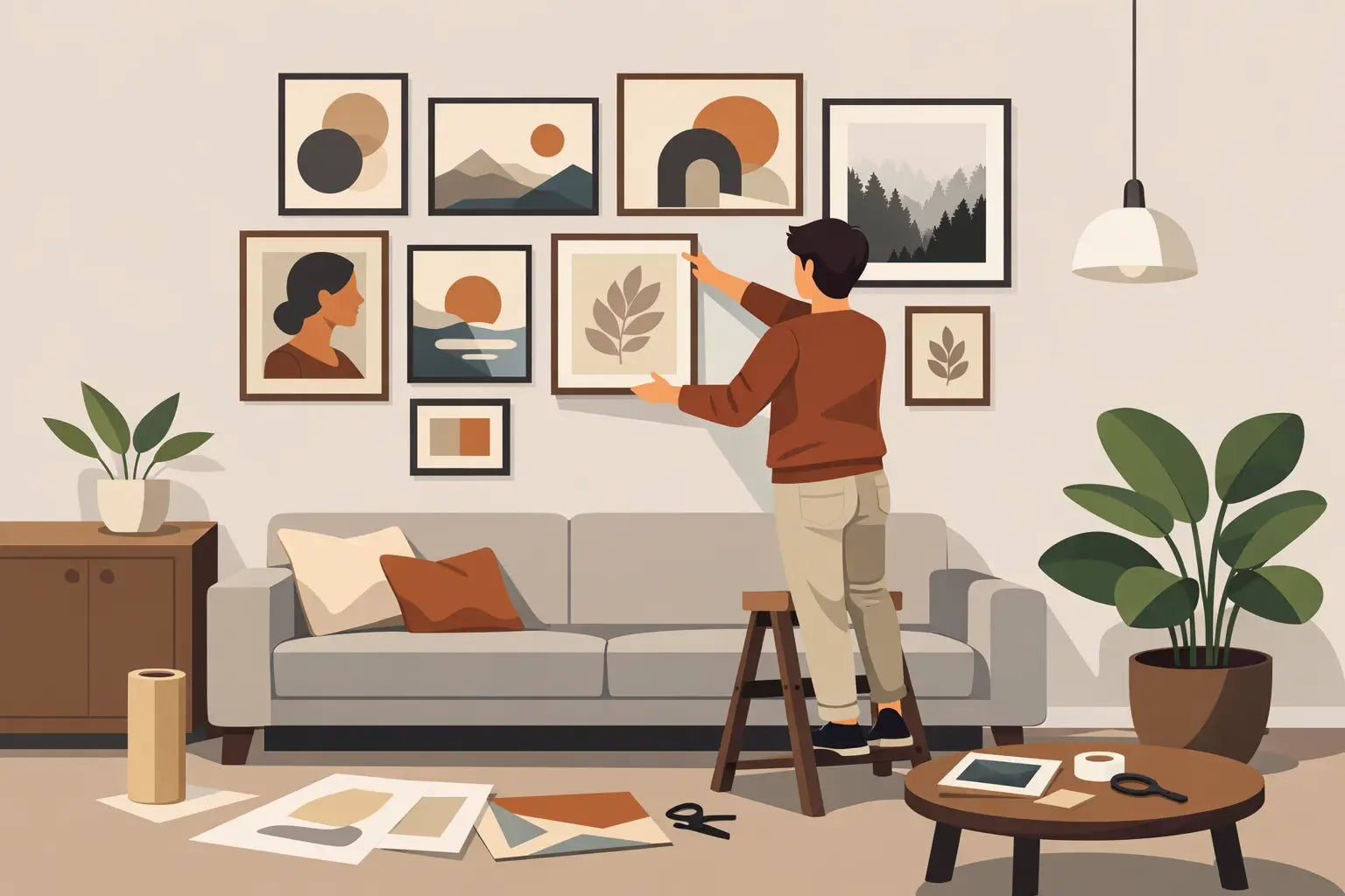
Yes, this seems obvious, but it really saves hassle. First, lay your posters and frames on the floor in the arrangement you envision. Move them around until the proportions are right. Then take a picture so you don't have to puzzle again when hanging them.
Even smarter: cut paper templates to size and temporarily tape them to the wall. This way you can immediately see if the composition is too high, too wide, or too busy. Especially if you are combining multiple frames, this prevents skewed proportions and unnecessary drill holes.
What do you combine with a poster wall?
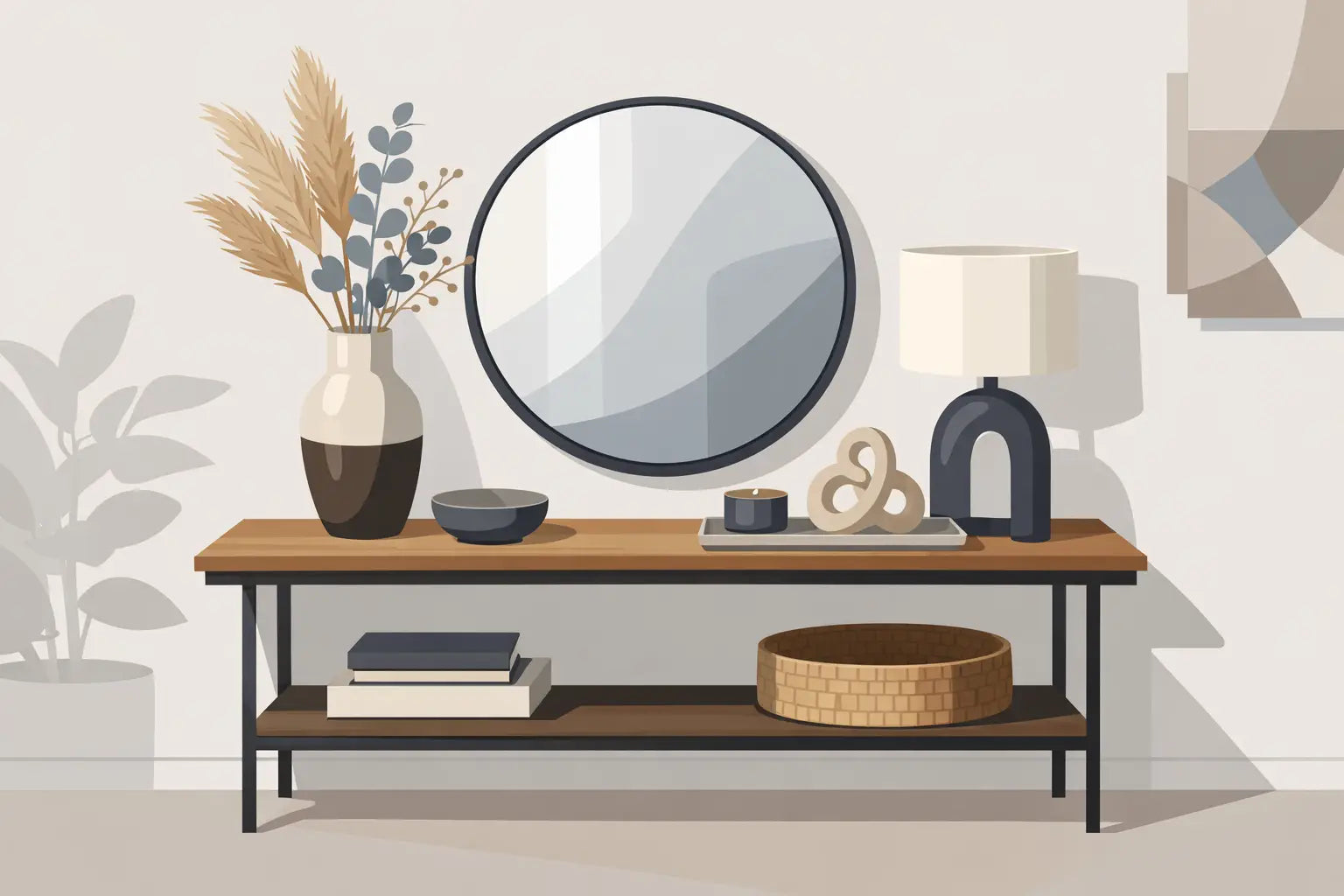
A good wall doesn't stand alone. It's the styling around it that completes the picture. A slender wall lamp next to it, a vase on a sidetable underneath, or a playful clock nearby can strengthen the entire setting. You don't want loose posters in thin air, but a corner that makes sense.
Do be careful that not everything is screaming for attention at once. If your posters are already very graphic or colorful, keep the rest around them a bit calmer. If you have chosen subtle prints, you can certainly go all out with a striking candle holder, mirror, or decorative object. There lies the balance.
Common mistakes when creating a poster wall in the living room
The first is thinking too small. A few modest frames on a large wall often do little. Dare to use scale. Your living room will actually look more mature and stylish as a result.
The second mistake is wanting everything to match exactly. A poster wall doesn't have to be a showroom display. A little tension makes it more interesting. If all prints have the same style, color, and shape, it can quickly become boring.
The third mistake is not taking distance into account. In a spacious living room, you look at a wall differently than in a compact seating area. Small details in posters tend to disappear at a distance. In a larger space, larger shapes, stronger contrasts, and clearer images therefore work better.
How to make it personal without a messy effect
Personal doesn't automatically mean cluttered. Rather, choose a few images that truly contribute to the atmosphere of your space. This could be an abstract print, a fashion photograph, a typographic poster, or an artistic illustration. Mix styles, but give them one common language through color, frame, or composition.
If you want to make it extra personal, you can add a few personal elements, such as a travel souvenir in a frame, an art card, or a print with a funny text that matches the energy of your home. Especially with a brand like Housevitamin, you see how well interior design works when it's not too conservative. A touch of humor or an unexpected detail often makes a living room truly memorable.
Don't feel like being perfect? You don't have to be
The beauty of a poster wall is that it never really has to be finished. You can start small with three frames and expand later. You can change them seasonally. You can move a print if the room changes. That makes it less daunting than paint or custom furniture.
So if you've been looking at that empty wall for a while and thinking something is missing, this is your sign. Choose a vibe, grab your favorite prints, and create a wall that doesn't quietly blend into the background, but happily participates in your living room.